You the real MVP!Crap, I forgot to include the links
Switch back to dark mode here: Change Color (https://tacoma3g.com/misc/style)
-
Welcome to Tacoma3G.com, a free resource for 2016-2023 Toyota Tacoma owners!
Tacoma3G is a beginner-friendly 3rd Generation Toyota Tacoma forum (2016-2023 model-year specific). We are a small community of people who are focused on good information and good vibes. More about us....
You are using an out of date browser. It may not display this or other websites correctly.
You should upgrade or use an alternative browser.
You should upgrade or use an alternative browser.
T3G Feedback and questions about Tacoma3G.com - How can our community and website be better?
- Thread starter Tyler
- Start date
-
- Tags
- tacoma3g.com

Also: Dark mode for the new design coming soon!You the real MVP!
I used to belong to a Civic forum that had a 12 days of Christmas. The owner/moderator would reach out to sponsoring companies and dealerships and gather certificates, small give-away items and promotional items.
Then on December 13th they would pull a name at random every day until Christmas to get goodies.
Then on December 13th they would pull a name at random every day until Christmas to get goodies.
Search tags
Have you look into a way to add tags or increased the current tag options?
Feedback for Non-Sponsored vendors is still limited. Even the auto generated tags aren't available for use. Then also no options available to select from. I also had to default to "tacoma" for a tag to get it to post.
Same.
When my brain started hurting at around 4 am, I decided to do something fun and easy, which was add some pointless achievements.
Taking ideas for new ones btw!!

Trophies
You can earn trophies by carrying out different actions. This page shows a list of the trophies that are available.tacoma3g.com

Ah, just saw where it was busy. I was thinking that before I started messing around. But didn't want to remove your ideas.
At first I was thinking the O could be a portal. TAC goes in MA comes out. But was lazy and didn't want to mess with spacing.
But also could be TACOMA then a portal at the end. I had a different portal like thing inside the gear, but I guess I save it while hiding layers and it didn't show. Then I closed the browsers without saving the entire file. Photopea.
This is definitely a tough one to keep it simple and clean. I guess my ideas just seem too much "Tacoma" without the emphasis on portal.
Last edited:
Thanks for sharing this. I’ll look into it tomorrow.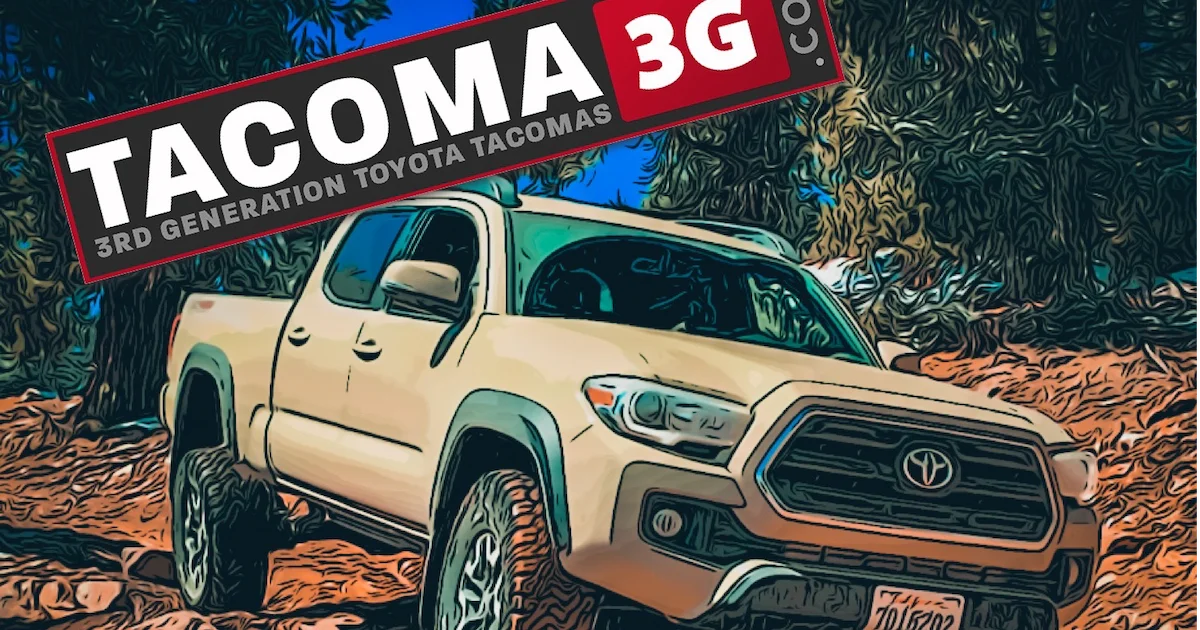
Search tags
tacoma3g.com
Have you look into a way to add tags or increased the current tag options?
Feedback for Non-Sponsored vendors is still limited. Even the auto generated tags aren't available for use. Then also no options available to select from. I also had to default to "tacoma" for a tag to get it to post.
April fools. Mine is pink too.
Was this always here or is it new?
The pink and the text font are April fools.
The part you just asked if that was always there: It has been there since I launched the new 2.0 version of the website. That page is a homepage; one that didn't initially exist. It is meant to be the first thing you see when you land on the site from a Google search, and it is meant to help people find what they might be looking for more efficiently. That page is a work in progress.
The part you just asked if that was always there: It has been there since I launched the new 2.0 version of the website. That page is a homepage; one that didn't initially exist. It is meant to be the first thing you see when you land on the site from a Google search, and it is meant to help people find what they might be looking for more efficiently. That page is a work in progress.
Classifieds:
Would you be open to simplifying the Classifieds?
Doesn't allow you to post without a prefix. Since the regions won't always apply.
Consolidate For Sale and Wanted. Possibly color code to differentiate the two.
Then prefixes: WTS/WTB/WTT/SOLD. Then one of these: (FREE/GAW/PIF)
Then for items that won't be shipped could list location in the title or thread.
Yes, classifieds needs work. I have some work-in-progress stuff that I can show you later.Classifieds:
Would you be open to simplifying the Classifieds?
Doesn't allow you to post without a prefix. Since the regions won't always apply.
Consolidate For Sale and Wanted. Possibly color code to differentiate the two.
Then prefixes: WTS/WTB/WTT/SOLD. Then one of these: (FREE/GAW/PIF)
Then for items that won't be shipped could list location in the title or thread.
The colors that it used look pretty cool.Noooooo Dark Mode. I can't do without it.
Had to grab an extension to skin it.

I did have the new dark mode but then it somehow started giving frequent server errors so I had to disable it while I try to fix it.
I am trying to go utilitarian with the new design -- functionality over flashy. I want the important content to either be front and center or at least easy to find. And all of the fluff and unnecessary links and menus and such, to not be there.
The colors that it used look pretty cool.
I did have the new dark mode but then it somehow started giving frequent server errors so I had to disable it while I try to fix it.
Is it .css or .js?
.css for most of the part that made the style dark. A little bit of .js for a different part.Is it .css or .js?
Not super familiar, but have messed around with it a lot for things.Are you familiar with one of them?
School and websites. Custom CSS files to set things up.
If you send me the file, I could see if I can see anything.
I was just gonna try to drop it in a folder and override styling script. See if I see any errors that stick out.
Also if you have a working one, it could be compared and modified.
I always used CSS.
I'm assuming it's just these?
Last edited:
Thank you
Anyone have quick suggestions for content that should be on FAQ pages about Tacomas? Or links to very helpful posts on the forums? Or anything of this nature?
Where would this page be? Would it be it's own separate info page or a forum?
Would you consider a forum restructure? I've been noticing some changes and the implementation of prefixes. Some forums requiring a prefix, but sometimes not having a fitting prefix for a topic. Is there a way to make it optional? Possibly allow 2 prefixes to be selected?
I feel regrouping would make the site easier to navigate and better organized for information. As it sits, I think parts of some forums are a little cluttered and there isn't a place for some things to go. Also with targeted feedback. Might get people who are more knowledgeable in specific areas prefer to hang in that section of the forum.
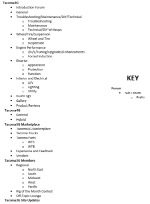
I attached a layout at the bottom. It looks like a lot has been added but the open circle bullets are just prefix identifiers. I think this pretty much has everything covered.
Reasoning for updates:
Modifications - May be too broad. I feel a lot of users when looking into things target specific and similar areas at once. Some users may just prefer modding certain areas and have no interest in others. The nice thing is all new posts would show on the front page as new posts or recent posts. So they would still maintain exposure to parts of the forum they wouldn't generally see.
Marketplace - I could clump For Sale and Wanted together. Then introduce WTS/WTB prefixes. A lot of times people search For Sale and overlook WTB. People who are selling something might only come across a WTB post of their item if they search for it. Putting them in one place keeps it around so when someone browses, they'll think, hey! I have that. I think this would improve engagement on the Marketplace side of the site.
Regional - I'd group them into larger regions. Less is more here since some people enjoy the travel part. Having more regions spreads activity too thin. With larger regions, people can go to their's and consider going to another event from seeing it. Broken down into more regions, they would miss it.
Attachments
This has been a big headache for me that I’ve been trying to find a decent solution for. I have made a lot of silent changes in this area so far but I still don’t like where it’s at.Would you consider a forum restructure? I've been noticing some changes and the implementation of prefixes. Some forums requiring a prefix, but sometimes not having a fitting prefix for a topic. Is there a way to make it optional? Possibly allow 2 prefixes to be selected?
I’m working on pages that will be something like this:Where would this page be? Would it be its own separate info page or a forum?
t3g .com /wiki/how-to-reset-maintenance-light/
t3g .com/wiki/differences-between-model-years/
That type of gist. The pages themselves, I think will kind of follow this format:
Help
 tacoma3g.com
I never thought of it like this. This is a mental note to myself because you make a big point here.Also with targeted feedback. Might get people who are more knowledgeable in specific areas prefer to hang in that section of the forum
Thank you for that!!I attached a layout at the bottom. It looks like a lot has been added but the open circle bullets are just prefix identifiers. I think this pretty much has everything covered.
I didn’t see the screenshot until now but I think I’ll have some time tonight to move the categories around like that. The more time consuming part is going to be moving threads into their proper sections. Especially threads in the ‘build threads’ section that are more of a question about something, which shouldn’t be there, but it isn’t clear I think.
Do you think the main interface of the marketplace section should be photo-first rather than text-first? For example, should I look more like this page? https://tacoma3g.com/photos/Marketplace - I could clump For Sale and Wanted together. Then introduce WTS/WTB prefixes. A lot of times people search For Sale and overlook WTB. People who are selling something might only come across a WTB post of their item if they search for it. Putting them in one place keeps it around so when someone browses, they'll think, hey! I have that. I think this would improve engagement on the Marketplace side of the site.
I’m trying to implement a new system to make this easier and more organized. They’re called tags but they’re not really hashtags like instagram, they’re more category tags.Modifications - May be too broad. I feel a lot of users when looking into things target specific and similar areas at once. Some users may just prefer modding certain areas and have no interest in others. The nice thing is all new posts would show on the front page as new posts or recent posts. So they would still maintain exposure to parts of the forum they wouldn't generally see.
You prob noticed some of them:
And here is what you would get when clicking one, using @Victory4x4 for my test: https://tacoma3g.com/tags/victory-4x4/